Tuesday, November 23, 2010

100 of Atlanta Homes Favorite Rooms

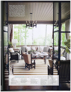
Today we are so excited because Atlanta Homes came out with their favorite 100 rooms over the last 10 years.  We are so pleased because we had our hands in 3 of the rooms! (66,86, &100)  There are so many beautiful rooms and talented designers.  It truly is a great group of people!

Check out our rooms!

Lake Keowee House Beth Webb and I did for Atlanta Homes & Lifestyles 2008 Designer Showhouse
 When we were we a part of Summerour Interiors we helped Decorate Keith's amazing Tower
     Christmas Showhouse, Beth Webb and I again teamed up to design this Chocolate inspired room.

Very exciting to be included with this talented bunch of Designers.  Congrats Everyone!

Tuesday, November 16, 2010

Mountain Home

Today it is rainy and overcast in Atlanta, as was yesterday.  So when I opened the House Beautiful for November I started drooling over the Mountain home that Stan Dixon and Kathleen Rivers designed.
The symmetry is a really cool aspect of this room.  I have a love for things symmetrical.  I also like door openings above with the wooden railing are so rustic right next to the crisp white planked walls.
I could totally hang out in the dining room eating that cheese and drinking that wine tonight!
The room has such a wonderful feeling.
This is the coolest idea.  Turning a little nook into a guest bedroom.  It is perfect for a mountain house.
The planked walls make it feel warm and a great contrast with the chocolate brown drapery.  Great way to close off the room.
Last but not least the screened porch. My favorite place to be in the fall. 
Congrats to both Designers, they did a great job!


Friday, November 5, 2010

The New Traditional

I just bought the book by Darryl Carter "The New Traditional".  I cant believe I have gone so long in
my design life without it.  But I began to think what does "The New Traditional".  Everyone I am sure has
their own opinions and design ideas about what it means.  I think one major theme is having textured/old items mixed with new items.  It is the balance of modern and traditional, which I call transitional.  I wanted to share some of the textured items I love.  I really love a space that you can feel it has been lived in.
For example, this kitchen it is a place of gathering.  The subway tile adds a clean lined nature to the space but in contrast to the old kitchen island with the dog pillows piled underneath makes the space feel inviting.  
I adore the stacked wood on the left.  It adds that rustic/warm nature to a clean lined living room.
This is one of my most favorite pictures.  I love the modern light with all this very rustic wood against a white background.  I love everything in this picture.  Do you?

Happy Friday! 

Tuesday, November 2, 2010

Martha Stewart's Kitchen

I always knew that I loved Martha Stewart.  She has had some rough patches but no one can deny the womancan design a beautiful kitchen.  When I saw her kitchen, once again, in her magazine I had to share with you all.
I love the wall color.  Image from Martha Stewart Living.
Two islands, if you can fit them, it's such a neat idea.  Love the white marble.  These floors are to die for! She says that they are reclaimed pavers from her garden.  They almost look like wood.  
More great shots of her very organized storage. 

I love the profile cut in the sidesplash of the marble.  Great hardware on the shelving also.

Does everyone else love this kitchen?  Happy Tuesday!